Confusion over MSU’s location will be settled when a new brand extension is implemented over the next two years.
Julie Gaynor, director of marketing and public information, said, “About 2013, we brought back the tower to Midwestern State and we simplified it, but it wasn’t a new logo. It was just a cleaned up version of an older logo. In 2006 we had a mascot change, so we brought in the mustangs logo. We’ve always had the athletic logo, which are the big letters. That’s been with athletics for a long time.”
Gaynor said the university is not going through a name change, and it is not necessarily going through a logo change.
“What it is is just an extension of our brand,” Gaynor said.
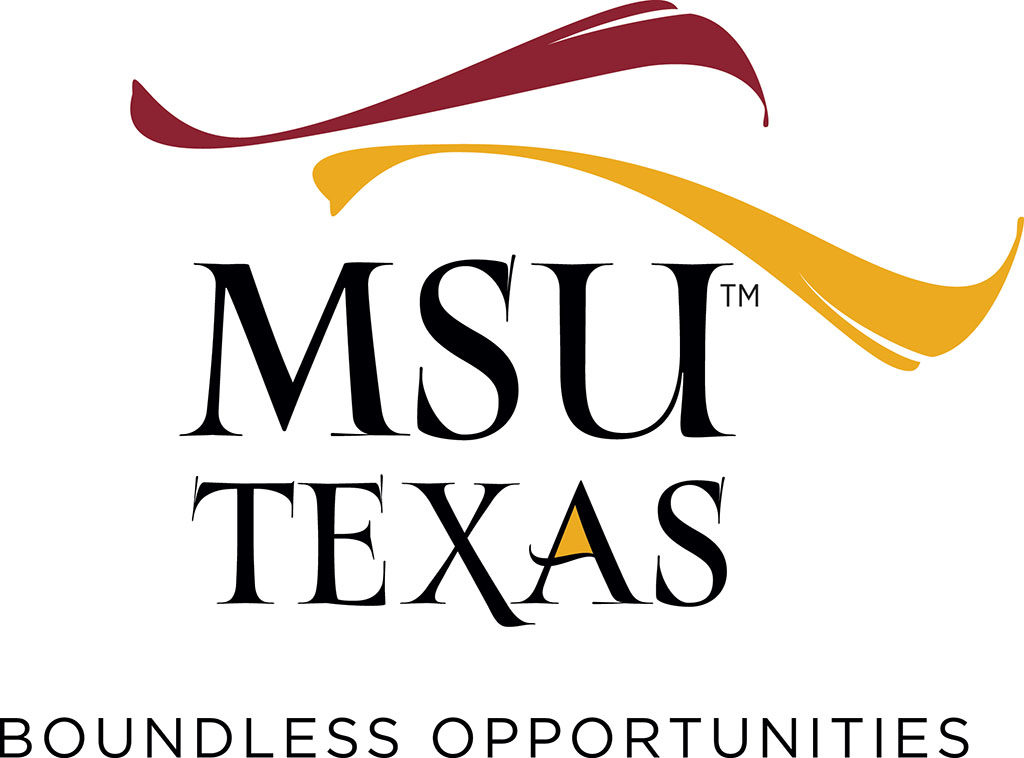
This logo, unveiled in 2017, will initially be used only for the comprehensive capital campaign.
CAMPAIGN LOGO
Gaynor said the idea came about when they started planning a comprehensive fundraising campaign.
Suzanne Shipley, university president, said, “We hired a firm to do our campaign logo, and we’re going to do a $50 million comprehensive campaign over seven years. You usually want it to look differently than how everything else on campus looks. They were charged with coming up with a look and they gave us a whole bunch of different looks.”
Shipley said she liked the design that had a swirl at the top because it looks like a horse’s mane or tail, and it also had the “Mustangs feel of movement.”
“The cost of a firm to create a campaign is $100,000 and that’s for a seven-year campaign,” Shipley said. “What they’ve created is the case and they look at the all the donor history so we know who to ask for what.”
Shipley said the firm does all of the feasibility work so that when they’re done the university can have materials that they can show people.
“It makes for an elegant and well-planned campaign,” Shipley said. “An elegant and well-planned campaign is more likely to have positive results. That money did come from a foundation, so rather than spend any student money or taxpayer money, I went to three different foundations and got the money from each of them for the next five years to do the fundraising.”
Shipley said she did not want to reveal the names of the foundations.
 BRAND EXTENSION
Gaynor said university consultants said they thought the brand extension would be a great platform, and asked if the university had considered using the idea outside if the campaign.
“At the time, we had started this new initiative in Flower Mound, where we’re going to offer upper level and graduate level classes for the working adults,” Gaynor said.
Gaynor said, “We are actually in the process of constructing a facility there (Flower Mound), and it is located very close to North Central Texas College or NCTC. It’s going to be a shared facility with NCTC. It’ll be a place where the working adult population can come and they can take classes in either a hybrid format or online.”
Shipley said the university spent about six to eight months looking for a location for this facility.
“We wanted it to be between here and Dallas, and hopefully on the Fort Worth side,” Shipley said. “We got a real estate agent who showed us around the hot areas where things are growing. We were looking for areas that would have plenty of services for adult students coming to class so that they could eat, buy things or shop, in addition to being on their way to class.
Gaynor said they hoped the facility would be open in the fall to help adult students complete their Bachelors of Applied Arts and Sciences degrees, but there was a delay in the construction and they now hope it will be completed in December.
“There’s such a need in the Dallas, Fort Worth area,” Gaynor said. “A lot of people who live there are place-bound, and necessarily can’t move as frequently and yet want to complete their degrees. Our BAAS is a really good program in the fact that people may have had to stop out of college, but they have a number of hours already. This just helps them to complete their degree and obtain their bachelor’s.”
“One of the things about our name, while we all love Midwestern State University, it’s a little bit confusing because we are not located in the midwest,” Gaynor said. “As we were making that leap into the Dallas, Fort Worth area, we looked at how we could take what was given from the comprehensive campaign and adjust to that.”
Shipley said the university looked at the name and some of the elements of their brand to see what to be improved.
“We could do MSU Texas Flower Mound, because the Texas establishes that we’re in Texas,” Shipley said. “The issue with MSU is that you’ve got Michigan State, you’ve got Missouri, you’ve got Mississippi, so there are a lot of MSUs. This clearly helps identify us.”
Shipley said she wanted the word Texas put the design in either the tagline or around the name because it is common for people to get confused about the location of the university.
“I told them I wanted something that placed us geographically,” Shipley said. “We should be really proud of the fact that we’re a public Texas institution. At that point, it was what is called a brand extension. The brand is Midwestern State University or MSU. The extension of the brand changes it slightly, but doesn’t necessarily revolutionize it. We are doing banners downtown and the Chamber of Commerce wanted MSU Texas on those banners, and those will have the Hardin Tower on it.”
Gaynor said they have slowly begun to introduce the idea on campus, and some alumni said they liked the idea because for the first time it helps people to better identify Midwestern State University.
Shipley said, “What had happened was people started hearing about it as we talked about the campaign, and everybody we’ve presented it to said can’t you use that for everything? We went to the Faculty Senate, the Staff Senate, the board, and more or less got the marching orders to transform anything we had that says Midwestern State University to MSU Texas over time. We’re not gonna roll out a big, expensive rebranding. We’re just going to, as we run out of things, put this on it instead of Midwestern State University: Make It Yours.”
Shipley said they presented the idea to the Student Government Association officers who then took it to the rest of the SGA.
Shayla Owens, management senior and SGA president, said, “My cabinet really enjoyed it. They thought it was a great way to differentiate ourselves from many of the MSUs that are out there, and show where we are in proximity to the rest of the world. It’s a new way to show who MSU is and the great things that are going on on our campus.”
2013 REBRANDING
Shipley said they thought it was better to take a small step towards the brand extension rather than just leaping right into it.
“Right now, we’re putting it on anything new, and we’re not going back and correcting the old,” Shipley said. “What you’ll see it on are the new banners, the new Flower Mound website, the Weatherford website and anything that is used for recruiting new freshmen next year. We’ll slowly have things show up at the bookstore. We’re just going to let it develop naturally.”
Gaynor said they always try to implement changes that are easiest for the university as a whole.
“In 2013, when we redid our letterhead, we phased it in,” Gaynor said. “I told people you have a year to use your letterhead, by this time next year please discard all of that so that you can order new and fresh.”
RELATED STORIES: It’s more than just a color
PRODUCED THANKS TO OUR ADVERTISERS
First Bank
Student Affairs & Enrollment Management
Department of Foreign Languages
The Yard Food Truck Park
Dr. Billie Doris McAda Graduate School
Career Management Center
Frank & Joe’s Coffee House


