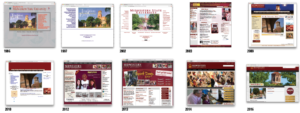
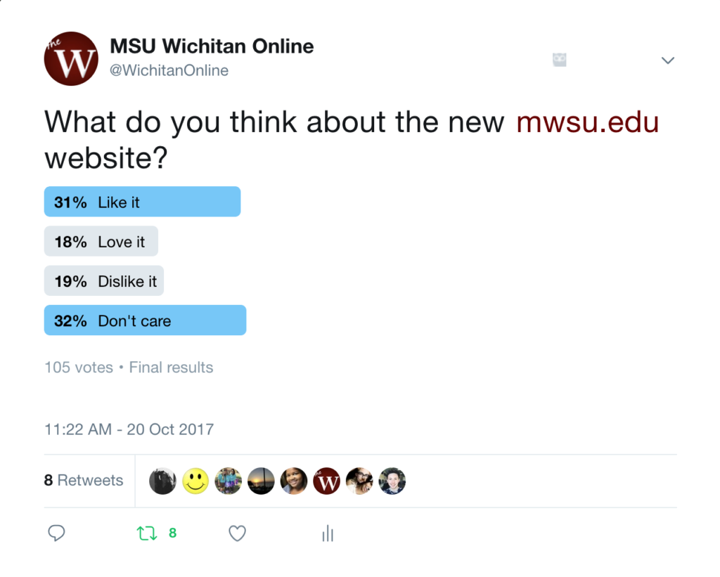
The MSU website has a new look — an updated design that is sure to catch the eye of any prospective student, active student or parent that stumbles upon mwsu.edu. The website was redesigned to be easier to use, more pleasing to the eye and an overall much cleaner look, according to Matt Shirey, webmaster, and Julie Gaynor, director of marketing and public information.
“My main role would be writing code here at MSU. I’ve been writing code for five years here, but I first started writing code in 2006,” Shirey said.
The last time they redesigned the website was five years ago when Shirey first accepted a job here.
“We tried not to make to big of a change. We actually looked at the websites of other universities like Texas A&M and UNT. The redesign focused on eye-catching images for current or prospective students,” Shirey said.
When a new device searches the website, the previous website design will come up until the user refreshes the page and will then display the redesign. According to Gaynor, analytics drove the design team — but there was also a committee consisting of faculty, staff and a student representative to be in the loop about the website design decisions.
“One of the goals that we want for the website is for it to be a recruiting tool for prospective students and prospective parents. We are trying to look at ways that captivate and capture that audience,” Gaynor said. “We work very closely with admissions — for instance, one of the things that we put on kind of last minute was our virtual tour. We had taken it down and talked to admissions and admissions said ‘no, we get a lot of direct hits off of that link.'”
Another change on the redesign is the MSU Texas on the top of the page. MSU Texas is part of the capital campaign that Suzanne Shipley, university president, proposed last spring.
“The design implementation has been planned for well over a year and we just had some stops and starts. We had planned to do that regardless and when MSU Texas came along, we just needed to incorporate that into our design,” Gaynor said. “It seems like it all came about at the same time. We knew it was time for a new fresh look to the website and it just so happened that they kind of coincided.”
Bold letters overlaying the pictures that say “Live, Lead and Learn” sit at the top of the new design.
“It’s very simple. There are a lot of images that portray the university so that prospective students get a sense of what the university is like just from looking at pictures. We knew based on the trends that we had seen that we wanted something much simpler and cleaner,” Gaynor said.
Some argued that the website did not need a redesign and was fine the way it was. Others argued the website was not being utilized to its full ability which is why it needed a redesign.
“We looked to see what is being utilized and we realized with the older design there was not a lot being utilized. We thought, ‘let’s put those efforts into the places that are being utilized and how we can string line that and make it easier for users,'” Gaynor said.
Because of compliance standards set by section 508 of the Rehabilitation Act of 1973, federal agencies, including public universities, are required by law to provide website accessibility and software to disabled people. For a website to be 508 compliant, it has to be accessible to all users and accessible on all devices, including screen readers and mobile phones.
“Part of the reason we needed to get the design implemented very quickly was because of the 508 compliance, which makes our site accessible for everyone,” Gaynor said. “We have a new content management system and there will be training for site masters this semester and next semester on that new content management system, which will really help us with the compliance. There will be a training component where they go out and talk to users about making sure that if we put an image up it doesn’t have text on it, it has text overlaid because unless we tag that and do some special coding on that a user may not be able to see that,” Gaynor said.
Gaynor and Shirey said they are excited about the redesign and believe students will love the new design. The two made sure the redesign will work across all platforms and most importantly they want to keep updating the website and making it easier to use for everyone.
Correction
In an earlier version of this article, the 2012-2016 website screenshots were in the wrong order. The Wichitan regrets the error.


