Maroon: It’s more than just a color
May 11, 2018
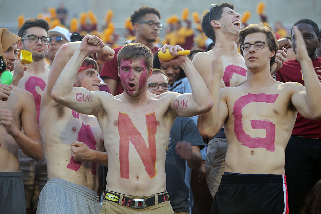
During football games students wave flags and paint their bodies with school colors. The Alma Mater proudly touts the maroon and gold. In the fall of 2015, to ensure consistency as part of the university’s graphic, the maroon shifted, in the eyes of some students, to more of a red color, returning to the official color adopted in 1987.
A look into the bookstore located in the student center shows the new color being used — a new form of maroon. On shirts to souvenir cups, the new maroon fills the displays.
“The new products are not really red,” said Jenny Denning, bookstore manager. “It is just a different shade of maroon.”
Sandra Barnett, assistant director of marketing and public information, worked together with Gaynor to find the perfect maroon for the school.
Barnett said LLP told us maroon and gold are the hardest colors to get because the shades of maroon can vary so much.
Denning added that the reason for the change in color had to do with the school becoming licensed.
The University entered an agreement with Learfield Licensing Partners to become the official licensing agency, permitting people who want to reprint official logos or official merchandise to do so only if they follow branding guidelines.
Administrators said they believe using Learfield guarantees:
- Added protection to the university brand
- Consistency of school logos and colors
- Additional opportunities for promotion
- Additional revenue stream
The benefits to licensing include protection of our brand, consistency of logos and colors and revenue stream.
The additional revenue could come from a 10 percent royalties charge for any outside vendor using the official school logo and colors on merchandise.
Even though the licensing agreement has benefits, there have been some issues regarding using local vendors. To use local vendors, the vendors themselves are officially licensed.
Julie Gaynor, director of marketing and public information, said, “It is the first time in a long time we are becoming our true color.”
Gaynor also explained that Midwestern’s maroon color, according the Pantone Matching System Color Chart, is 202C.
The color can be called garnet. It is defined a deep-red color.
“We would look around and see all the different colors that were being used and saw it as a dilemma. We went back and forth for a long time trying to see which color would represent who we are,” Gaynor said.
Gaynor said each company that they ordered products from had a different idea of what the color maroon was. They wanted to give the companies what our color is instead of producing different shades of maroon. She added that it is uniting all the products to the color that represents the school best.
Students display different viewpoints on the shift of maroon.
“It’s pretty trivial and irrelevant to be honest,” said Brandon Allen, junior mechanical engineering. “No one is going to notice the slight difference in change from more blue maroon to a more red maroon.”
Allen also said they should have just left it the other color.
Other students, like Kenadi Campbell, computer science sophomore, said she believes the change to be more pivotal when it comes to representing the school.
Campbell said, “If they’re planning on making that weird ketchup, red color our new maroon, we’re going to look like a bunch of hotdogs when they add it to the gold.”
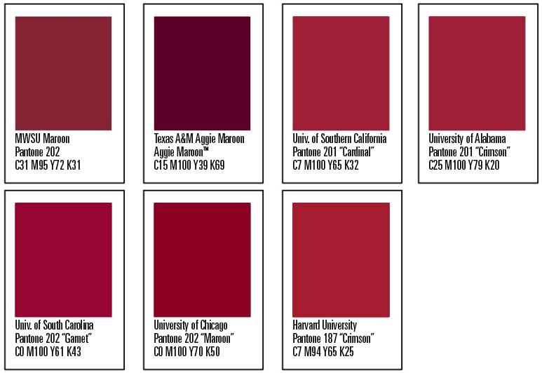

GRAPHIC IDENTITY SYSTEM
- Midwestern State University, Pantone 202, “Maroon,” C31 M95 Y72 K31
- University of Chicago, Pantone 202, “Maroon,” C0 M100 Y70 K50
- University of South Carolina, Pantone 202, “Garnet,” C0 M100 Y61 K43
- University of Alabama, Pantone 201, “Crimson,” C25 M100 Y79 K20
- University of Southern California, Pantone 201, “Cardinal,” C7 M100 Y65 K32
- Harvard University, Pantone 187, “Crimson,” C7 M94 Y65 K25
- Texas A&M University, custom Pantone color, “Aggie Maroon,” C15 M100 Y39 K69
MAROON DEFINED
- Pantone | 202C
- RGB | 135, 36, 53
- CMYK | 31, 95, 72, 31
- HEX | 660000
FLASHBACK FROM 1987
The Colors Committee suggest that the University adopt the following ink colors as guidelines for all campus-wide print publications. They are:
- Pantone 124C Gold and Pantone 202C Maroon for slick paper finishes;
- And Pantone 124U Gold along with Pantone 201U Maroon for flat (or dull) finishes.
- The printer must show evidence that the above colors can be duplicated on any paper chosen.
- In instances in which fabrics are chosen, and it is impossible to exactly duplicate the above colors, efforts will be made to replicate as closely as possible, those colors (chosen above) by the Colors Committee.
PRODUCED THANKS TO OUR ADVERTISERS
First Bank
Student Affairs
Frank & Joe’s Coffee House
American National Bank and Trust
Sports Clips
Balance Studio

William Statham • Nov 11, 2015 at 3:02 PM
Keep MSU maroon!
Diane Conrady • Nov 6, 2015 at 1:51 PM
Good luck with your petition to be heard about the school color issue at MSU. As a graduate, and former athlete (a LONG time ago!), we need to re-establish dark maroon and bright gold as our colors. These are the colors that we associate with our great university. There were some good reasons to change the mascot, but I see no reasoning behind changing our colors. I wish Dr. Ligon and Nick Gholson were around to help you with this!
How do we sign your petition?
DIane Conrady